pure is my default camera
If you had taken a screenshot of the camera app’s home screen for every major release of iOS you could create a collage that tells a couple of interesting stories.
First, it’s a story of the steady march of product development. From a simple view finder, maybe a digital zoom and a shutter button. To SLR grade composition tools, advanced post-production editing, and now generative AI features.
Second, it’s a story of the power of default apps. Apps that are able to integrate new hardware APIs independent developers don’t necessarily get access too, and the challenge presented to anyone who crazy enough to try and compete.
As a product manager with going on 20 years of experience, and, more recently, as a student of the political economy of digitisation, both of these stories interest me. But for the purpose of this post I am interested in the second.
Faced with the challenge of competing with the camera app one might choose to lock themselves away in a garage and build an n+1 app, where n is the number of features the default camera app already has. But an incremental approach like this would be madness when faced with the resources at Apple’s disposal and the unfair advantage they have as both the default app and control over the iPhone’s future hardware. The other option is a to differentiate, and, ideally, do something Apple can’t. Which brings me to pure.
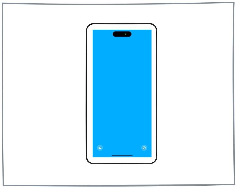
pure is a camera app for iOS released this year that — and I appreciate were only nine months through the year — is easily my favourite new app of 2024. What makes pure so special is that when faced with such a huge competitive mountain to climb Trevor Welsh opted to release something with even less features than the camera app had when it debuted in 2006. Don’t believe me? Check out this screenshot of its home screen.

There isn’t even viewfinder or shutter button. Just a blank screen staring back at you and buttons to access the minimal settings it has, and your photo library. To take a photo you touch anywhere on the screen and the output is dropped into your camera roll. To make matters worse, you can only take 12 in any 24 hour period unless you purchase more for $/£0.99.
So what makes such an obviously deficient user experience so special?
First, the limitation on photos has made me more motivated to take photos. I guess the scarcity of shots (versus the never ending iOS camera roll) has activated that classic FOMO bias. I want to take them because I don’t want to lose out. And in turn that’s reminded me how much I enjoy taking photos.
Second, the lack of viewfinder means I spend less time trying to compose the “perfect shot” and more time just getting it done. In fact, trying to position your eye just above the lens and contorting your body to align everything adds a fun physical component to taking a shot that reminds me of using classic point and shoot with an optical viewfinder.
Third, the app automatically applies a filter to the shot, which, based on what I can tell from experimentation, is determined by how much light the shot has. If you’re someone who is paralysed by the endless choice of filters and editing options but would like to “add some pop” to your photo, this is a joy. In fact, I’d go as far as to say this is a feature that will end up in the default apps if it’s not already burried somewhere.
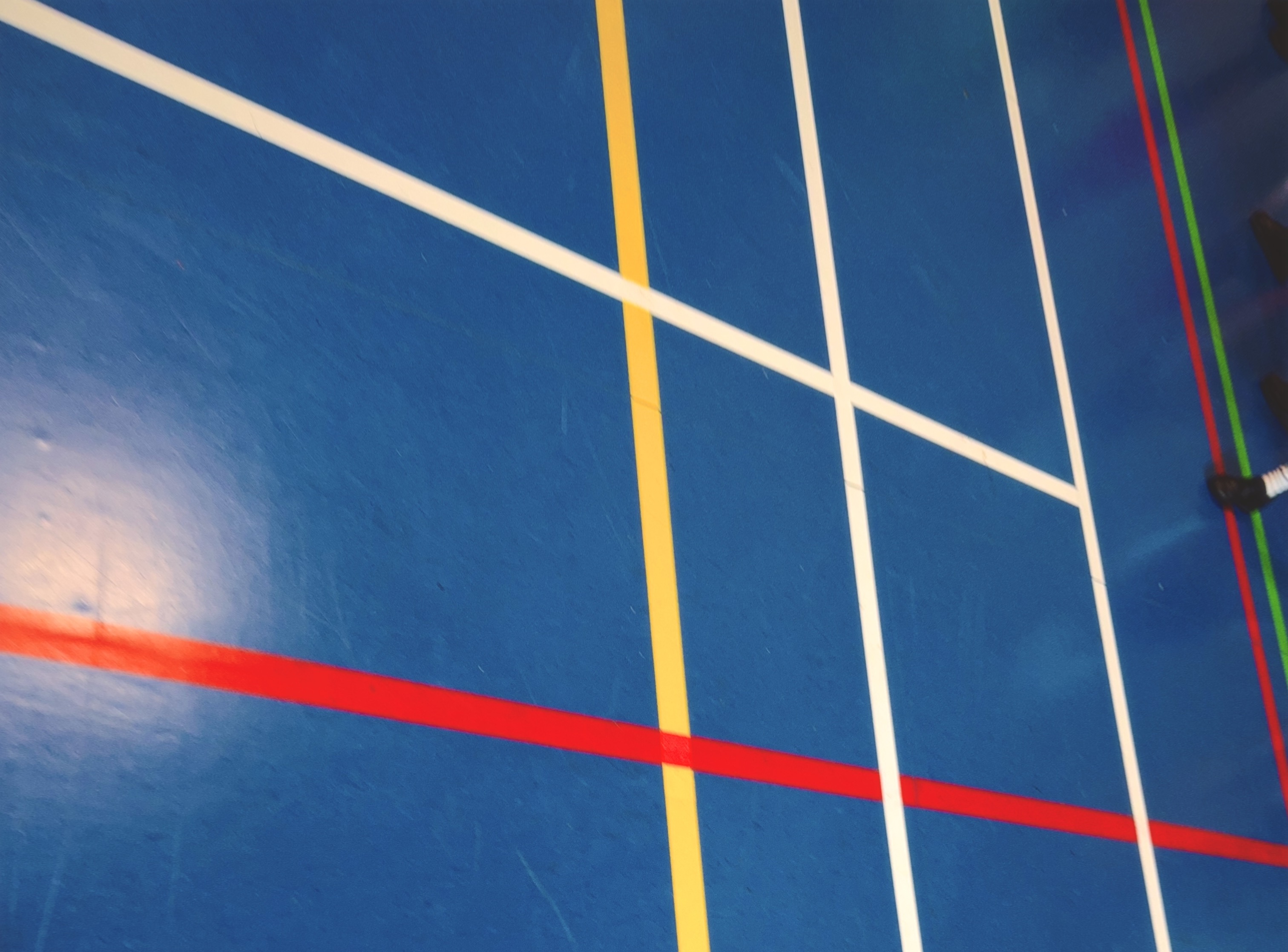
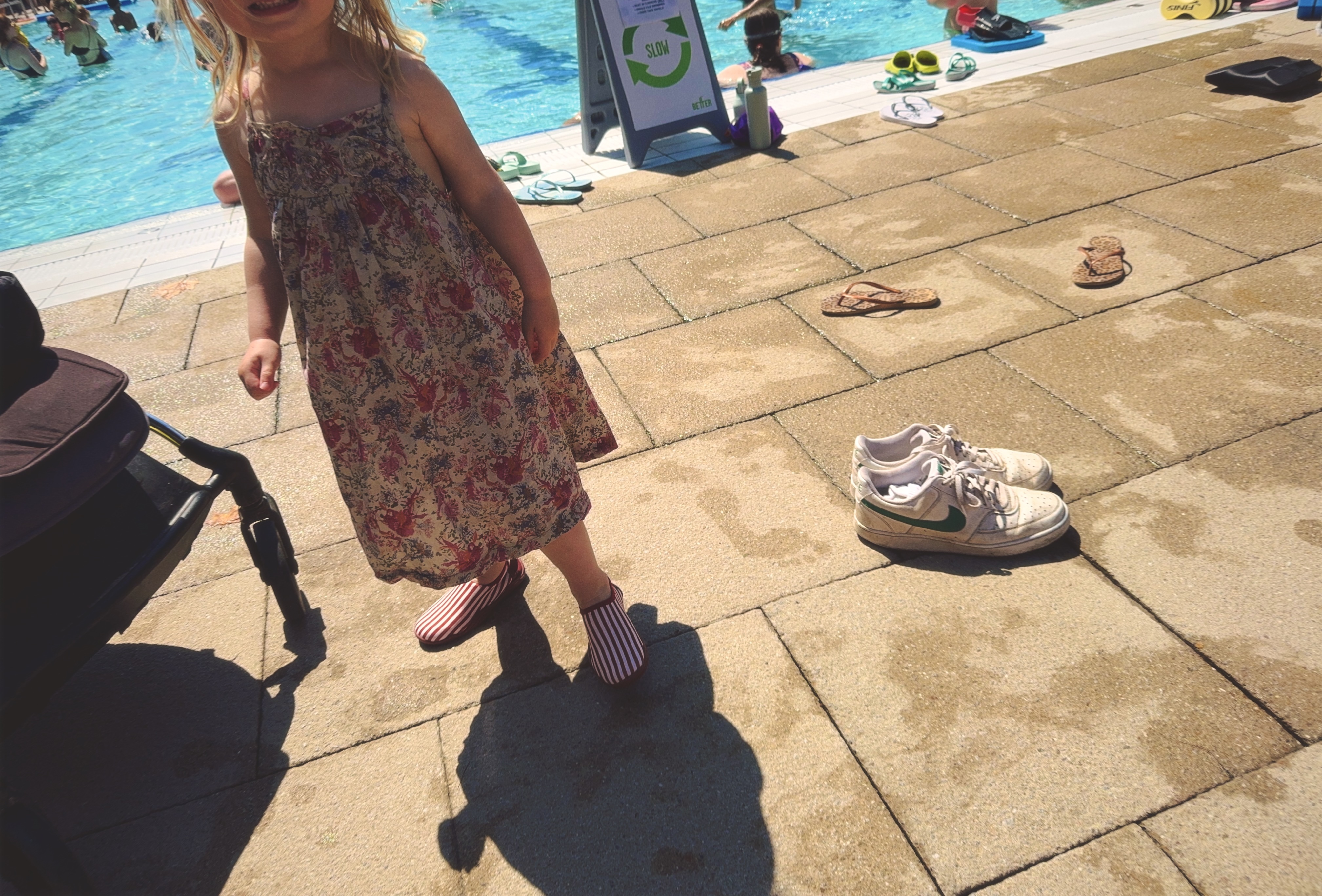
Finally, the shutter button is so sensitive that you often find yourself taking shots you didn’t intend to. Now, given that you only get 12 shots a day, this might seem like a bug, but I actually find it to be one of the app’s best features. It leaves you with these awesome shots that don’t necessarily capture the moment as you might have intended, but do offer a window into your world that the “perfection” of modern cameras and their corresponding apps don’t allow for anymore. Check out these two shots, one from my son’s football class and one from a trip to the lido to get a sense of what I mean.


pure can’t compete with Apple – just take look of yesterday’s iPhone 16 update to be reminded of that. But pure can do something Apple can’t. It can remove all the UI distraction, all of the advanced features, all of the AI, and instead remind you that the joy of photography reveals itself when you stop worrying about the photo you are taking.