The problem with the back button
Loosing my iPhone seemed like a good opportunity to make the switch over to Android, a platform that until very recently, I am ashamed to admit, I knew very little about. It also felt like a good time to make the switch given that Android is entering into a period of convergence - both mobile and tablet devices will soon use the same version of the OS. And because with iOS 6 Apple hasn’t really set the world on fire.
I’m likely to weigh in here and on Twitter with opinions about the device (I’m running a Galaxy Nexus) and also the OS and its apps in the coming months, but first I want to talk about a major first gripe. The problem with the Back button.
For those who aren’t aware the Back button and it’s companion the Up button are both core navigation patterns - you can read about them on the developer website here. The Up button is software based and navigates hierarchically within an app. Imagine you’re looking at a group of contacts and then click on one. The Up button would take you to the level the preceded it. The Back button however is hardware based and navigates temporally between screens. In the example before they would perform exactly the same function, however image you had landed on the contact from Home screen. While pressing the Up bottom would still take you back to the contacts group, pressing Back would take you home.
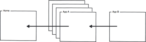
This all seems logical enough however more often than not it doesn’t work like this. In fact after only a few minutes of using the phone it becomes very difficult to predict what the Back button will do, and for a user that’s very bad news indeed. The reason is simple, app designers will often leave out the Up button and instead hijack the Back button to perform its tasks. Let’s pretend you open an app from the home screen and then quickly open another app using the Recents button. Pressing the Back button should take you from the active app, to the previous one and then back Home; however if one of the apps doesn’t adhere to the Up buttons methods, and instead hijacks the Back button to operate as an Up button, when the user presses Back, rather than returning Home, they’ll go ‘Up’ a level within the apps hierarchy and will then be forced to press Back until they reach the app’s index screen and then finally Home. Here’s a visual explanation of that:
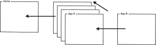
This is the correct method:
While App A has a stack of other screens above the active one the Back button will still take the user back to the Home.
In the incorrect method the user is forced to go back through the app’s hierarchy of screens before they get Home:
So who’s to blame for this? Well it’s not an easy answer. In part the app designers need to take responsibility for not sticking to the design principles outlined by Google. Certainly anyone who has released a new app since ICS launched deserves reprimanding. Older apps can be forgiven somewhat, the pace of change Android has experienced over the past 6 months makes it hard for developers to keep up, particularly if resources are stretched. This also puts Apple’s early strict app store policies into perspective. While many lambasted them for being overly draconian, what Apple succeeded in doing is creating an ecosystem of obedience, one where developers felt required to work closely to the HIG and ignore it at their peril. This in turn created consistence for users and ultimately a more rounded user experience. Google is clearly trying to rectify these issues, but it will take some time for that to be fully realised.
Android is a fantastic OS however, there will be more on that in the coming weeks.